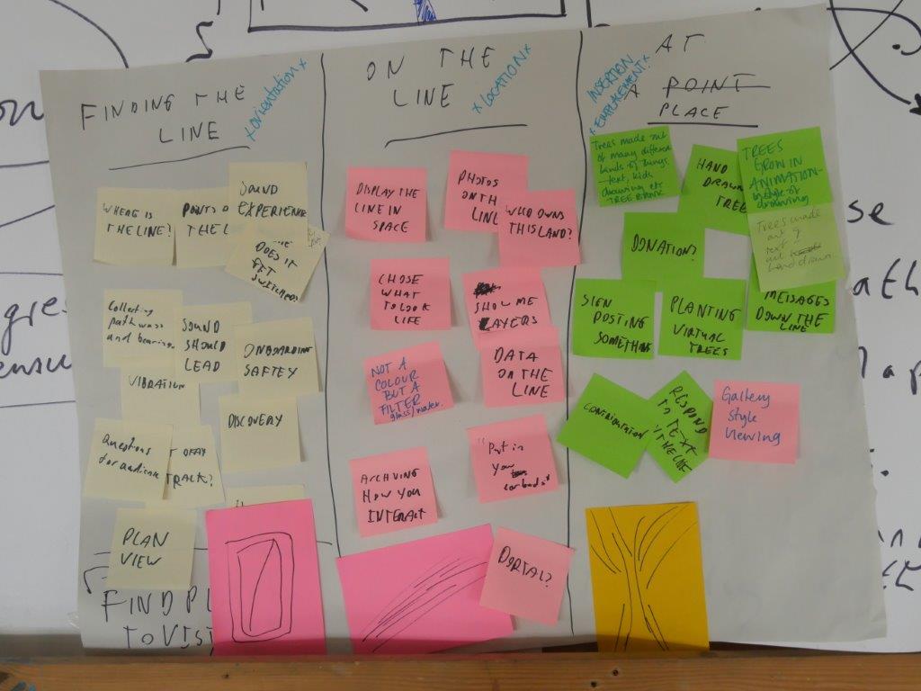
- If we assume a user has first made their way to within comfortable walking distance (e.g. a few hundred metres at most) of The Common Line, how do we optimise their experience of locating and visualising the Line?
- What they will see on their screen when they first turn it on – Open Street Map with the option of either Satellite or Plan map view. Suggest satellite as default?
- They also need an instruction about opting in or out of the Trace function. Opt in as default, or is this inappropriate – does it require active consent?
- Can we presume a basic level of map literacy, such that we assume people will be able to navigate to within easy sight of the Line on their screen? It feel we have little choice but to do so.
- We also assume certain forms of mobility at this point. The vast majority will be pedestrians, it is just about possible that some could be on a bike/mobility scooter. What about someone in a car, bus, train? Do we need to design a fleeting experience of the Line for them? A siren or ambulance-style doppler wail as you pass?
- To what extent, if at all, do we need written instructions/guidance/optional clues on the screen? Do we need, for example, instructions such as ‘Where is the Line from you now? North, south, east, west? What local landmarks might help you find your way to the Line?’
- For the pedestrian user, how will the Line appear? We are committed to a set of plotted dots in a line. But what colour? Simply a colour corresponding to the status of the point (vacant, digital tree, agreed for planting etc)?
- What colour? It needs to be vibrant/primary to be clearly visible against the background, but is green best? Softer yellow? Soft orange? Black crosses?
- The user navigates themselves, with written instructions/clues or not, to a point on the Line. What happens then?
- Ideally, there would be some kind of fanfare/siren, the screen would become a window on the world, and the user, holding it up before them, would see a line of digital trees marching away from them along the course of the Line, into the distance. But this is not technically achievable.
- The difficulty is that the experience of the Line risks being deflating, unimpressive, a bit meh etc. at this stage. The user finds themselves marooned upon a mute point, without guidance as to where the Line is running, without a sense of scale and perspective etc. For those lacking map-based skill/confidence, the experience risks being disorienting and off-putting.
- So we need some orientation mechanism, via which alignment occurs, and the Line is revealed in all its scale and splendour.
- Our current compass orientation does not work well, and in some ways actually compounds the issue of confusion and loss of motivation.
- If there are two or more users working together, the solution is to reveal the trajectory of the Line through their own bodies. In other words, they navigate to adjacent or nearby points, and they can then literally see the direction of the Line when they look at each other.
- If they are alone, we require some screen-based instruction or indication. Idea: they rotate their phone and the points *flash* or change colour or the phone vibrates or makes a noise when they are aligned (either northward or southward).
- A voice intones (and I jest, but only a little): ‘you are now standing upon The Common Line, and are looking along its course. Imagine this line made tangible in the landscape as a living line – a line of planted trees’
- The experience of locating and aligning with the Line has to be in some way revelatory and rewarding. It cannot be humdrum or frustrating.
Professor John Wylie, 17th July 2018

